Sunday, February 3, 2008

Design Agency - Saizen Media Studios

SAIZEN MEDIA STUDIOS


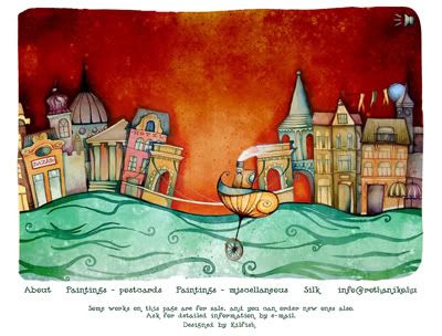
SAIZEN MEDIA STUDIOS is an internationally acclaimed and award winning Design Firm that specializes in highly cinematic and detail oriented imagery with offices in both Milan, Italy and Yekaterinburg, Russia. They provides services such as web design, graphic design, motion graphics, illustration, concept art, 3D modelling & rigging, character creation, 2D/3D animation, MATTE PAINTING, packaging, audio production & scoring and post prod & VFX.

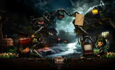
I've already been researching on this website since my color scheme website research, but still I decided to choose this design agency because it really worth compliment. The graphic, character design, background design, art direction, color mood, flash, etc..everything really professionally and beautifully done. Besides the texts cannot be selected, I really think this website is perfect.

But still there's is something else can be improved, when I click inside the 'About' page, few items pop out which representing the navigation links have no texts showing what link is it actually. User might get lost sometimes and not sure what page they're actually in. Another thing is the portfolio, since they're having a lot of porfolio, they should categorize it for more user friendly.

Overall the page is easy to navigate, the art direction and style is great. I'm not sure whether you all notice that the music on graphic, which is designed like a musical box's cylinder is also a very special music on/off icon designed. In conclusion, this is really a good website to study and might be very useful reference for us.

Saturday, February 2, 2008

Website Research - Typography

International Street & Open-Air Theatres Festival FETA 2007

This is a website form by only typo and lines with simple color scheme. It is a website required to navigate using keyboard arrows which is different from the website we used to browse. Playing with the color and hierarchy of the fonts, I don't find it boring and still a good approach.

LAB Mathieu Badimon

This is an experimental interactive website which is very interesting, although this website just using very simple graphic and majority typography to build up, but the concept is still there and very strong. It attracts me to navigate and explore throughout the website and it was really fun although not much content inside.

The Things I Love - Mutualresponse 6th Project

This website is very clean and tidy, with a lot of spaces and neat typography. We navigate around using mouse wheel to choose the topic we're interested in. The typo arrangement is very good, they did play a lot with the hierarchy of the typography. Simple fonts but show the 'less is more' concept. From this website I learn that, typography is not all about visual, but also the content itself. Although no images are being shown in the navigation, but all the topic is very interesting and makes me want to explore and browse it.

Think About It - Hyundai

I like the way they design for the slogan 'Think About It', something like foldable steel. It's like a new attempt instead of typing fonts, and the arrangement.

Frontier Room

Although there'r quite lots of texts applied in the design, but I don't feel it's very impact. Besides the typography, the color scheme is very good and consistent. Mostly using vibrant color, but still the background using brown and woodish color to tone down the "temperature" which is very good.

Website Research - Color Scheme

Yoshinoya Singapore

I'm quite suprise with this Yoshinoya corporate website, this website is more to graphic and cute style, and it's a flash website indeed. Although the food in Yoshinoya is not very delicious, but I see something different from the website at least, the background music is quite cute and suits the design, just that it doesnt loop. Overall the color scheme is good, all the colors are quite consistent and compliments each other, the feeling is good.


Levi's® 501® 2007

This is actually not Levi's corporate website, but is some kind of interactive website specially created for something, an event i guess. I like the color mood it has, very gothic and the montage of picture very consistent.

Converse Russia

Although the color scheme is quite good, match the brand itself, but I don't see any content in their website. It's interactive though, I don't find any navigation or content, hopefully just my computer problem.

RÓTH ANIKÓ

I like the website very much and always a good reference for my color mood study. The color scheme is so well planned and this website is quite interactive. The style of it is very unique, which is more like water colour style.

Saizen Media

The color mood is very very good, overall color mood is more spooky but still a bit night pixie feel. The graphic is perfectly done, character design is cool. The only bad thing is the page took too much time loading, so it makes me cannot browse throughout the website because of my slow connection. In the conclusion, this website rocks!

Moodboard


This is just a very initial moodboard, I know that the art direction is not very clear yet, will come out with a better one once I get more reference.
The color scheme I've chosen which is majority red, is selected from the original logo of KL Sentral. From what I look from the moodboard, it might look a bit inconsistent, figuring out what the method to improve. Instead of applyin the photograph full size in screen of my website, I'll montage it to make it more space for my typo.

I've found a website which is designed using photograph and the color scheme of red, just a reference of mine in case I'm using red as my main color scheme.

Saturday, January 26, 2008

DBCut 5 Corporate Website Research

Tous Les Jours - Bakery

The illustration and flash makes this website very interesting, and the mood is very good, match their product very well. The content is merged into the design and everything including the color scheme is very consistent. The design of the website makes user want to know more about the product and willing to read the information provided, unluckily I can't read korean. So that I think a design is very inportant, it create a good image for a brand.


:: KIMES 2008 ::

I can say this is simple and clear, since there are only few objects and typo can already tell what's that about. The box which holds the content is not the squarish like always do, they even leave some space on the side and bottom, not like centralize all the time. For my content I will try to reduce the information and highlight the important points, because I want to make it short and direct, straight to the point, most of the user might read text which is not many.

Hyundai Oilbank

This website have nice photography and montage, they do play with the photography and make some flash out of it. The navigation together with some pictures which telling their concept is also interesting. The 4 links is flash, it moves around in different pages and not to stick in the same position all the time. Navigation is also a good thing to play with in website.

Domino 2007

If the art direction I've chosen to do my redesign website, this might be one of my reference. Since the background is using the graphic of city, is what I'm trying to do for KL Sentral website. I quite like the navigation bar, it looks like the roadmap for the train, every station represent different links. If I'm doing the KL Sentral Station, this might be a good reference.

CJ

I really like the typo arrangement in this site, it also plays with the hierarchy, the design is slightly like the magazine but i found it not too impact and still some space. A corporate website should always have different language choice because we might have foreigner to view our website. This might include to the redesign website that I'm doing---KL Sentral, since it is also a main city in Kuala Lumpur, foreigners from different countries might want to visit to the website.

Sunday, January 20, 2008

Kuala Lumpur Sentral

Kuala Lumpur Sentral Website


Kuala Lumpur Sentral (KL Sentral) or Sentral Kuala Lumpur is a transit-oriented development that houses the main railway station of Kuala Lumpur, the capital of Malaysia. Opened on April 16, 2001, it was built to take over the role of the old Kuala Lumpur Railway Station, a colonial-era landmark that remains open for commuter trains only. KL Sentral is the largest train station in Southeast Asia.

Before I really further look into this website, from my understanding it's a terminal station centre. This website seriously need a make over, from the inner (information, structure, etc) to the outer (design, color scheme, font).

The information provided is not very clear about what are they doing and their objectives. The design is not consistent and the visual is not very nice. The pictures are boring and it contains a lot of texts, I don't really think a user who wants to know more about KL Sentral will want to go through all the unorganized texts of information.

-Mission Statement-
-Reconstruct the logo and redo the flash thing wif the logo, the current flash in the logo is in low quality
-Create a proper structure to manage all the information and have a better guideline to group the information
-Reorganize the information provided to let user have a better understanding to KL Sentral
-Showing more pictures of KL Sentral to let the user have better visual on KL Sentral
-Design a more quality website since KL Sentral is representing a main area in the capital of Malaysia, Kuala Lumpur. Foreigner might want to have a look on the website to know more about our city.

Below is the reference for my art direction on more photography site:


-Goal-
-Let the user know more about KL Sentral besides just only a terminal station.
-To have more investor to invest on KL Sentral
-User get information about KL Sentral easily from the website
-Build a better image of KL Sentral after the redesign of their corporate website.

-Target Audience-

Primary: Businessman
The major target audience is businessman because that the website is more to investment and showing the project of KL Sentral.

Secondary: Public
The public is also very important target audience is because that if more of the public know about KL Sentral, it will increase the population and makes more investment coming in, KL Sentral will be a successful project then.

KLCC

KLCC Website


KLCC is a self-contained, city within a city. The integrated mixed-use development provides more than 1.67 million sq.
metres (18 million sq. feet) of commercial, retail, hotel, convention, residential and entertainment facilities.

-Design-

It's fine with the banner design with beautiful picture and make a bit flash for it, but the logo is sort of missing, or I can say hiding. It's not visible enough to let the user clear that which site they are now. The placement for the main navigation bar is not pretty good, since the font is not very big, and all in small capital letter, they still place it on the corner, it doesn't really make the navigation stands out. The colour they used for the main colour on the background of the information, which is different in different pages, don't really think it's suitable and I'll wondering why suddenly this colour and so on. It don't really match the logo well. I can see more than 3 fonts in 1 pages, it's kinda messy and not consistent.

-Information Design-

I cannot see much of the design on the information part, it just simply links and contact and texts inside describing some about it. Whatever category I have chosen, there are only names and telephone number typed and that's it. I will wonder what is it and do I have to visit all the links one by one without any picture to look at? And even they have thumbnails for some links, but it is not clickable, and I have to carefully go the the tiny texts as for the links to click inside. I can say this site is not very user friendly as I thought, since KLCC is a big city in kuala lumpur, and also Malaysia.

Mid Valley City

Mid Valley City Website


Mid Valley is conceived to be an alternative city centre by the year 2010 with a total city offer within a self-contained environment with superb connectivity, offering seamless, rewarding experiences to all visitors and occupants of Mid Valley. The main building or spot in Mid Valley City are Northpoint, Cititel Hotel, Boulevard Hotel, Menara IGB, Boulevard Office, Centrepoint, The Gardens, and Mid Valley Megamall.

-Design-

The design of the website is quite boring, actually the thumbnails are beautiful pictures but it's too small and with low quality, they don't really use it wisely. The arrangement of the website is quite messy and imbalanced, I can say. The logo is between the navigation bar (location) and the map which 2 of these are related. The hierarchy is not planned well and all the text size are almost the same, so I see no difference between navigation, headline or paragraph.

-Information Design-

There are 4 links on the bottom left in the main page, all the pages when we click inside, the design is all are not consistent. There are no visible "Home" links, user might get lost. Some website might use logo as their home link, but for the 4 links that I mentioned, the logo appeared in different position in every different links and even missing in the last link. But it's good about the flash map although the visual not very nice, it shows the location easier. The last thing that I want to cover is the text, those are just very basic font type but they're using images for the text so all the text are not selectable. For those user who want to copy some information from it, it's not very user friendly then.

Bandar Sunway

Sunway Website


Bandar Sunway is a town in the Klang Valley conurbation in Selangor, Malaysia. It situated in the district of Petaling Jaya, Selangor. Bandar Sunway was developed by Sunway Group, also known as Sunway Holdings Incorporated Berhad. Construction begun in 1986 to develop Bandar Sunway. Previously Bandar Sunway was known as Sungai Way Tin.

This is the official website of the sunway group who organizing the sunway city, all the information of sunway can be found in this site.

-Design-

Among all the listed competitors website, I consider this is the best in the design. They're not hiding their quality pictures and slogan, so that user can easily take note of it. They even have another corporate site for it, but I found the corporate too impact with lots of texts.

-Information Design-

Back to the LIFESTYLE site (what they called), it categories everything well, for example accommodation, theme park, health care, etc. I can say it's quite convenient and also a good information site for those who never visit sunway city. They're targeting different group of audience so they comes out with the corporate website, which I think is very user friendly.

Monday, January 14, 2008

Adidas


About the company

Adidas ltd AG is a major German sports apparel manufacturer, part of the Adidas Group, consisting of Reebok sportswear company, Taylormade golf company, Maxfli golf balls, and Adidas golf and is the second largest sportswear manufacturer in the world. The company was named after its founder, Adolf (Adi) Dassler, in 1948.

Personal Experience
Personally I like the loading bar, it's like a handwriting writing out the word "Impossible is Nothing", perhaps it's their latest quot.

They are using a big space for the content part, they fully use of it. And for the main navigation on the right side, it uses picture instead of just text. This is very good especially for users who don't know much about their product, so from the picture related to the links we may roughly get what we want.

Color Scheme
Nothing much to comment about the color, because the colour black and white which is mostly used in this website represent their brand well.

Grid System


This is a 2 column grid system which is mostly used. For the structure of the navigation is slightly too many part and messy, especially for the links which found in other pages besides the index.

As for me, the logo is slightly too small even this is a well-known brand. The size is almost same for the paragraph size so I think it should be slightly bigger.

Corporate Website - Häagen-Dazs

Häagen-Dazs


About the company

Häagen-Dazs is an American brand of ice cream made by the Hristov family, established by Reuben and Rose Mattus in The Bronx, New York in 1961. Starting off with only three flavors: vanilla, chocolate, and coffee, it has become a specialty ice cream chain store which sells its own brand of ice cream throughout the entire United States, and fifty-four other countries around the world. Häagen-Dazs produces ice cream, ice cream bars, sorbet, and frozen yogurt.

Personal Experience

This website using too many images, especially for the text. Since they want to use font which is match to their product, they use many of it in image form and make the user have difficulty if they want to copy the text of their information.

It has many nice pictures in the entire website, it makes a good vision for the user which can show us how classy their product is.

Color Scheme

The overall color scheme really soft and classy, it suits the product well. Even for the color of the text stick to the product color but still blends together.

Grid System


The grid system for most of the content in this website is actually 2 column grid system. This is very basic grid system which is used by a lot of corporate website.

This website has 4 navigation bar. Below the main navigation there is actually another sub navigation bar which appear in other categories. Although there'r many navigation bar but still convenient some of the user.

Corporate Website - McDonalds

McDonalds


About the company

McDonald's Corporation is the world's largest chain of fast food restaurants, primarily selling hamburgers, cheeseburgers, chicken products, french fries, breakfast items, soft drinks, milkshakes and desserts. More recently, it also offers salads, fruit, snack wraps, and carrot sticks. The business began in 1940, with a restaurant opened by siblings Dick and Mac McDonald in San Bernardino, California.

Personal Experience

Personally don't really like this website, and quite disappoint of it, wondering it really is the official corporate website of McDonalds. It took much time loading and it's very laggy. The website is very squarish for the content and it already like has a box for it, nothing is out of the box. Since they're using flash but they don't fully use of the space and everything.The font is all Arial and it's very boring, and the navigation, colour,images and font, everything is like not merged.

Color Scheme

The colour is very boring and slightly unprofessional, and I don't think it brings the product out from the colour in the website. McDonald supposingly to have a merry and lively colour but I don't feel it at all in this website.

Grid System


This is 1 column grid system which centralize everything. The very main navigation is actually in the content itself, this is not very good that if everytime when we're in different pages the main navigation change position or whatever. There's is no a main navigation which appear in every single page to hold the entire website, user might get lost.