Tous Les Jours - Bakery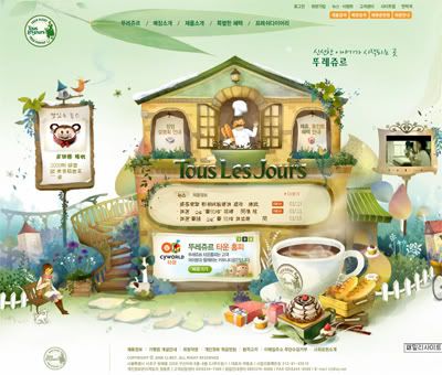
The illustration and flash makes this website very interesting, and the mood is very good, match their product very well. The content is merged into the design and everything including the color scheme is very consistent. The design of the website makes user want to know more about the product and willing to read the information provided, unluckily I can't read korean. So that I think a design is very inportant, it create a good image for a brand.
:: KIMES 2008 ::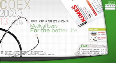
I can say this is simple and clear, since there are only few objects and typo can already tell what's that about. The box which holds the content is not the squarish like always do, they even leave some space on the side and bottom, not like centralize all the time. For my content I will try to reduce the information and highlight the important points, because I want to make it short and direct, straight to the point, most of the user might read text which is not many.
Hyundai Oilbank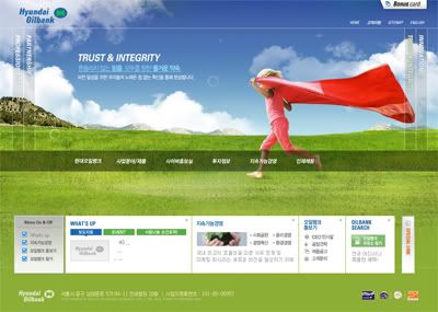
This website have nice photography and montage, they do play with the photography and make some flash out of it. The navigation together with some pictures which telling their concept is also interesting. The 4 links is flash, it moves around in different pages and not to stick in the same position all the time. Navigation is also a good thing to play with in website.
Domino 2007
If the art direction I've chosen to do my redesign website, this might be one of my reference. Since the background is using the graphic of city, is what I'm trying to do for KL Sentral website. I quite like the navigation bar, it looks like the roadmap for the train, every station represent different links. If I'm doing the KL Sentral Station, this might be a good reference.
CJ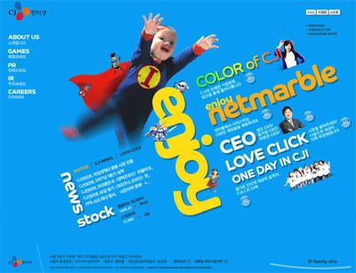
I really like the typo arrangement in this site, it also plays with the hierarchy, the design is slightly like the magazine but i found it not too impact and still some space. A corporate website should always have different language choice because we might have foreigner to view our website. This might include to the redesign website that I'm doing---KL Sentral, since it is also a main city in Kuala Lumpur, foreigners from different countries might want to visit to the website.

4 comments:
in my opinion, i think that the direction for olibank is much suitable for KL sentral website.
What i m considering is the feeling of KL sentral gave me. When i try to imagine, what appear inside my mind is real life photo to show how great the city is.
KL sentral is a place where work > entertaiment. More to serious or office kind and i think typography and photography will help a lots in term of showing the Corperate Identity of the KLsentral.
* graphic can be use as the icon/label. (to show the feeling of signboard) and those sign show the city where the city are RUSH, MODERN, and EXPRESS which i think the KLsentral is.
anyway I never do a deep research on KLsentral so mayb i might be wrong too. it is just my opinion.
just ignore if there is smtg wrong.
by, yiwei
i think Tous Les Jours - Bakery more suit to my nescafe wahahaha,(joke joke)
Domino 2007, ya is a good reference of it, but if u really wan to use the illus as background ,it may quite challenging, if u wan combine with real image. I quite hate the background colour in that web but i love the concept that they use.
CJ website, ya it playing some typo and nice, IF it is a artwork. But in website i don't think is a good idea to rotate the content like that it quite annoying to get people reading at it.
i also agree with ywei that the olibank website is much suitable for KL Sentral website cos it is a place more for business and office working.A serious and classic website is suitable for it^^
@@I do feel weird to comment on the same website(KL Sentral) but you did a very good job on the corporate website research!Yeah~
to me, i agree with zyen. the domino is much better for your kl central. though the colour can be a bit different, but the direction is heading the right path. Love the navigation, simple and straight forward telling the audience where you are and what type of website they are viewing.
Post a Comment