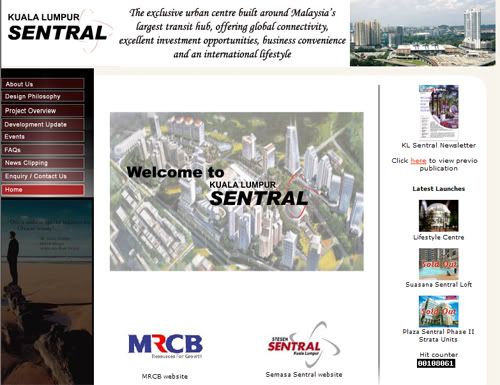
Kuala Lumpur Sentral (KL Sentral) or Sentral Kuala Lumpur is a transit-oriented development that houses the main railway station of Kuala Lumpur, the capital of Malaysia. Opened on April 16, 2001, it was built to take over the role of the old Kuala Lumpur Railway Station, a colonial-era landmark that remains open for commuter trains only. KL Sentral is the largest train station in Southeast Asia.
Before I really further look into this website, from my understanding it's a terminal station centre. This website seriously need a make over, from the inner (information, structure, etc) to the outer (design, color scheme, font).
The information provided is not very clear about what are they doing and their objectives. The design is not consistent and the visual is not very nice. The pictures are boring and it contains a lot of texts, I don't really think a user who wants to know more about KL Sentral will want to go through all the unorganized texts of information.
-Mission Statement-
-Reconstruct the logo and redo the flash thing wif the logo, the current flash in the logo is in low quality
-Create a proper structure to manage all the information and have a better guideline to group the information
-Reorganize the information provided to let user have a better understanding to KL Sentral
-Showing more pictures of KL Sentral to let the user have better visual on KL Sentral
-Design a more quality website since KL Sentral is representing a main area in the capital of Malaysia, Kuala Lumpur. Foreigner might want to have a look on the website to know more about our city.
Below is the reference for my art direction on more photography site:
-Goal-
-Let the user know more about KL Sentral besides just only a terminal station.
-To have more investor to invest on KL Sentral
-User get information about KL Sentral easily from the website
-Build a better image of KL Sentral after the redesign of their corporate website.
-Target Audience-
Primary: Businessman
The major target audience is businessman because that the website is more to investment and showing the project of KL Sentral.
Secondary: Public
The public is also very important target audience is because that if more of the public know about KL Sentral, it will increase the population and makes more investment coming in, KL Sentral will be a successful project then.

3 comments:
First, i can tell the home pages font not consistency. Whole websites is doesn't look like a websites. Kuala Lumpur,is a city of MALAYSIA. Should put in some identity of Kuala Lumpur.
Their interface design doesn't give a focus point to viewer.Liked u mention, had to reconstruct from the inner to the outer. Navigation, photo, font , information, link and etc.
In visual, i think find some interesting photo with nice angle can attract viewer look in further. Information you got to reconstruct and categorize it nicely.
I liked the art direction reference you showing there, ya! YOU CAN DO IT~
GAMBATEH :D
when i lauch the kl sentral website, i realise some of the content were overlap on the navigation, i wonder may be it's just my browser problem. i can say that...this website really "leong" lo..
The website dun have a well table to hold those content, the content just like simply put in.The consideration of margin,border,grid system should be take care in organize the content.
Images play a important rules to give the visual to consumer. The website itself doesn't increase the trust and quality of KL sentral, the images of the environment and facility in KL sentral can add more to create the visual.
erm i do agree with you, i'm pretty disappointed with the website T-T(it should be neat, tidy and proper planning of the information at least)
There are much more info which is not updated and not mention about.
Images could be added in appropriately to enhance and make the website much more interesting.
Iim sure u'll come up with a website which will be much more better.
Post a Comment