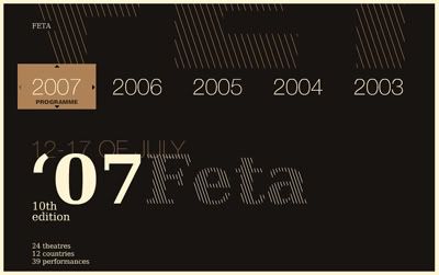
This is a website form by only typo and lines with simple color scheme. It is a website required to navigate using keyboard arrows which is different from the website we used to browse. Playing with the color and hierarchy of the fonts, I don't find it boring and still a good approach.
LAB Mathieu Badimon
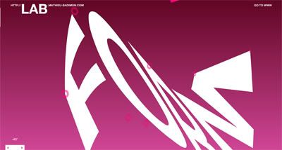
This is an experimental interactive website which is very interesting, although this website just using very simple graphic and majority typography to build up, but the concept is still there and very strong. It attracts me to navigate and explore throughout the website and it was really fun although not much content inside.
The Things I Love - Mutualresponse 6th Project
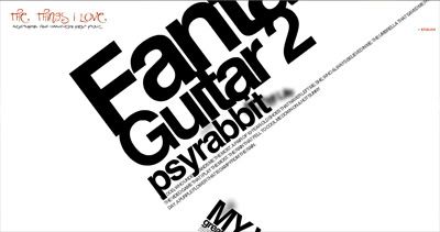
This website is very clean and tidy, with a lot of spaces and neat typography. We navigate around using mouse wheel to choose the topic we're interested in. The typo arrangement is very good, they did play a lot with the hierarchy of the typography. Simple fonts but show the 'less is more' concept. From this website I learn that, typography is not all about visual, but also the content itself. Although no images are being shown in the navigation, but all the topic is very interesting and makes me want to explore and browse it.
Think About It - Hyundai
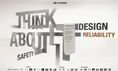
I like the way they design for the slogan 'Think About It', something like foldable steel. It's like a new attempt instead of typing fonts, and the arrangement.
Frontier Room
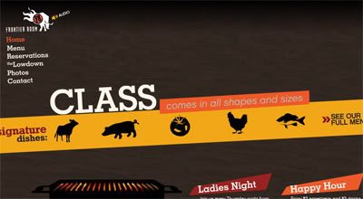
Although there'r quite lots of texts applied in the design, but I don't feel it's very impact. Besides the typography, the color scheme is very good and consistent. Mostly using vibrant color, but still the background using brown and woodish color to tone down the "temperature" which is very good.

No comments:
Post a Comment