About the company
Häagen-Dazs is an American brand of ice cream made by the Hristov family, established by Reuben and Rose Mattus in The Bronx, New York in 1961. Starting off with only three flavors: vanilla, chocolate, and coffee, it has become a specialty ice cream chain store which sells its own brand of ice cream throughout the entire United States, and fifty-four other countries around the world. Häagen-Dazs produces ice cream, ice cream bars, sorbet, and frozen yogurt.
Personal Experience
This website using too many images, especially for the text. Since they want to use font which is match to their product, they use many of it in image form and make the user have difficulty if they want to copy the text of their information.
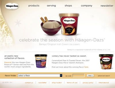
It has many nice pictures in the entire website, it makes a good vision for the user which can show us how classy their product is.
Color Scheme
The overall color scheme really soft and classy, it suits the product well. Even for the color of the text stick to the product color but still blends together.
Grid System
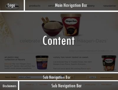
The grid system for most of the content in this website is actually 2 column grid system. This is very basic grid system which is used by a lot of corporate website.
This website has 4 navigation bar. Below the main navigation there is actually another sub navigation bar which appear in other categories. Although there'r many navigation bar but still convenient some of the user.

No comments:
Post a Comment