Monday, October 22, 2007

Before & After

Before

Okay..for this I didn't actually fixed on any layout...
my problem is the image treatment and quality...
and so on....


After

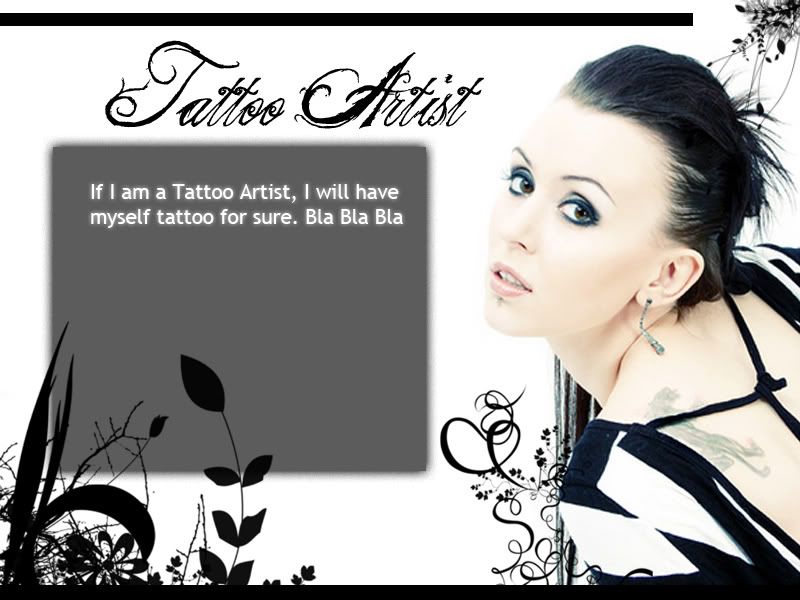
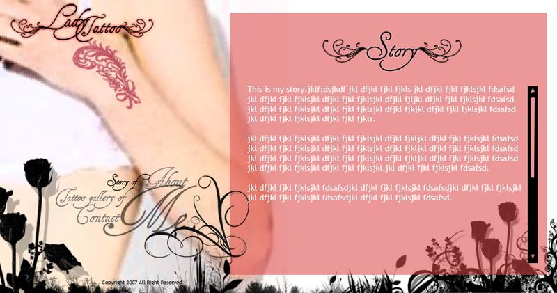
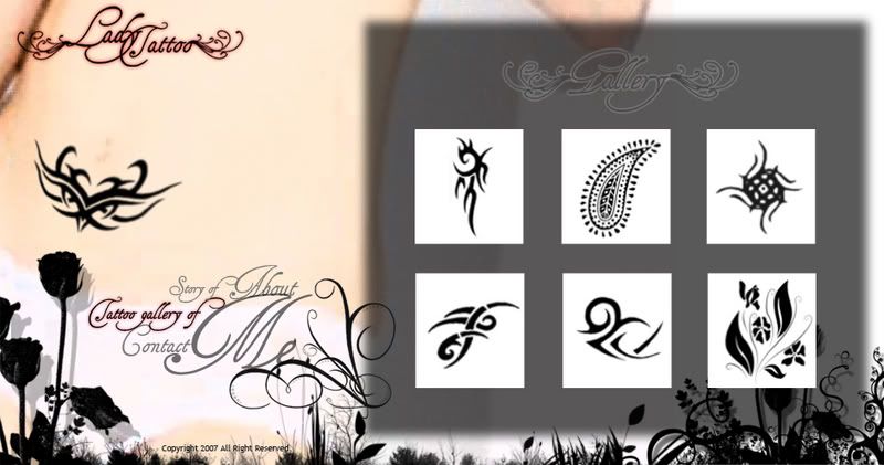
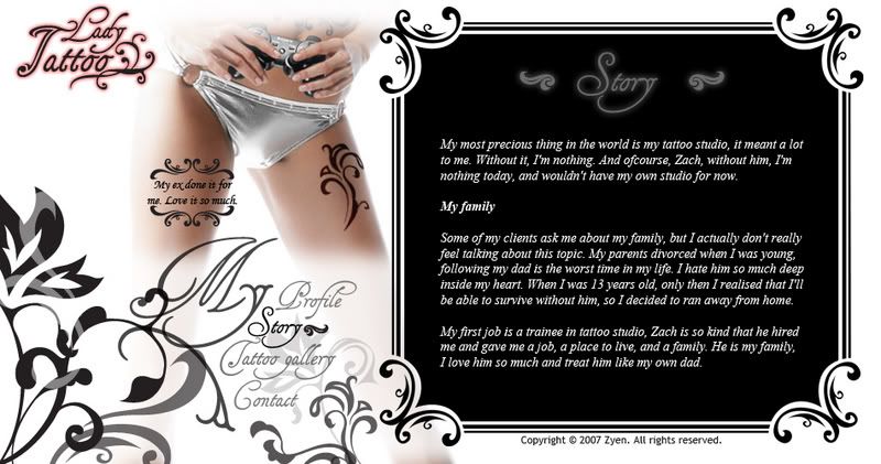
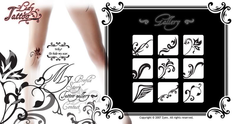
After that I try to redesign every single elements which applied in my design. I used it for my background treatment and also my tattoo design.

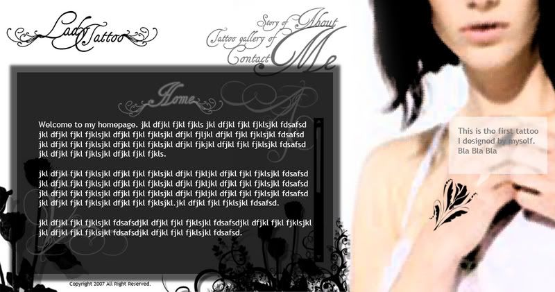
I know it look kinda messy, so...I really need help/comments on this of how to improve. Since I'm using only black & white (except logo) for my entire design, so it's quite challenging on the arrangement of the background elements.

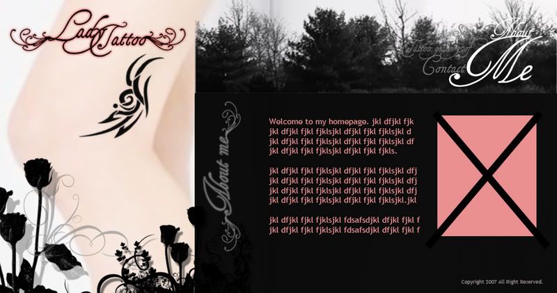
I try to use another image instead of the previous 1, and try to make it smaller.

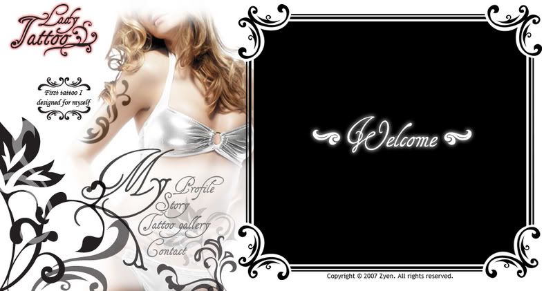
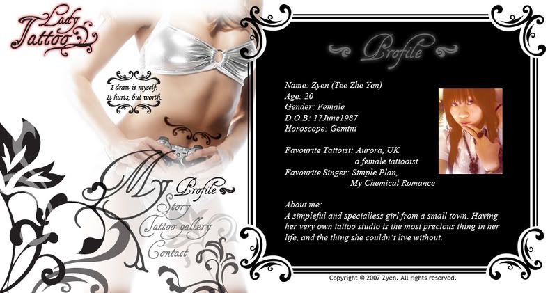
For my profile's portrait, just temporary I think because I really need some time to montage if have to make myself look like the lady inside.


I know there'r still many problems so I really need feedback. Thanks.

Monday, October 1, 2007

Interface Art Direction

I tried to research for tattoo artist personal website but I couldn't find any, so I try to know more about tattoo in Tattoo Johnny. This website really helps me a lot to know more about tattoo, what we have to prepare and also the cleaning steps after we get a tattoo and so on.

Tattoo is very popular in western country but hardly find even a teenager got a real tattoo here, so it makes me research more on tattoo artist in western country than local tattoo artist. Sorry that I don't have many images for this post, but I did read through lots of texts from the internet.

I hardly find a website which is close to the art direction I want to have in my mindset. I roughly did 1 interface in photoshop to show roughly how it feels.

My entire website design will always have half and part of a lady figure on the left side, which mean I will cut a full body into different part and put them on different pages. (For example, the main page will show the face, the final page will have my legs part, and the images will always on the left.) Then in different pages, there'll be different tattoo on the body, with a short description for it. At first I planned to have my navigation be the tattoo and tattooed on the body, but I worry that different part of body will keep me moving the navigation around, so...I will consider of another way to apply my navigation.

For the background, it will always be white, clean clean white. The elements will be added on, if possible I will try to animate them to make them slightly bloom out. I don't want my design to be too colourful. For me, I love black tattoo more than a colourful one. So black and white will be my main colour in my design.

Monday, September 17, 2007

Web Design - Web Analysis - Website 5


This is the official website of
Horlicks.
I never think they will done that beautifully
on their official website. This website gives a
very comfortable feeling and they show obviously that
the benefits of this product which is to have a good night sleep.

-Navigation-
First of all, I like the cursor which is animated
to match the design, a small glowing flying creature.
So when we move to an object, the object will light up
while the rest objects are dark as in night.But for the
quick links navigation, it is quite difficult to explore.
The main links are only three, which are
'Can't Sleep', 'Understanding Sleep', and 'Horlicks'.

-Interactive-
During the loading page, they did give us a lot of information
about Sleep. From the message I can feel that they're not
purposely to promote their products, but to educate us
more about Sleep. There is a part that few items floating
on the river, they're actually the links, so we can move
the cursor left right to check out the links.

-Colour-
They have very soft and comfortable colour and
with the colour they did bring out the feeling
that they want to deliver. The theme for the
website is Night, so they mainly use only
navy blue and the yellow of the moon.

-Grid-
I don't see the division of grid except for the
content on the centre of screen. The title and disclaimers
are not shown. The quick navigation links are not
shown until the mouse over the moon. So the arrangement
of this website is too simplified.

Web Design - Web Analysis - Website 4


Hungry Suitcase is actually a website of
test to check out our vacation personality.

-Navigation-
It is easy to navigate because on the main page
we are directed link to the test,
which is the main idea of the website.
For the rest of links, all are shown in the bar bottom too.

-Interactive-
For the vacation personality test part,
there is a room with lots of things,
We just have to drag the items that we prefer to pack
into our suitcase to the hungry suitcase on the bed.
After 10 items are packed, the result of personality test will be shown.
The result will show our personal stats and vacation stats.

-Colour-
It gives me a feel of vacation with the background colour
for the content, brown. But for the fonts and other elements,
there are slightly too many colours are used. Using a group of
specific colours can represent a personalities of that website.
-Grid-
The layout is well-organized and neat.

Web Design - Web Analysis - Website 3


This is the website specially designed for the project
Coke + Faithless.
A new alluminium music bottle are designed for the project
and characters to match the website design.

-Navigation-
There are different animated characters
representing different links on the bottom.

-Interactive-
This website really play with the interactive well
because we can play with it not only with the mouse, but
also the keyboard, webcam and microphone.
The picture which is shown above also part of
interactive. We can type anything on the keyboard to
make the design apply on the bottle in graphic style.

-Colour-
I really like the colours applied on the bottle, it is
so colourful and attractive. It leave a big area of
white space so that we can focus more on the content.

-Grid-
This site is really breaking the rules of grid and they
don't even have a exact area for the loader bar. The
weakness of this part is they don't have the grid for
the title and disclaimers.

Web Design - Web Analysis - Website 2

This is the flash official website of the movie The Pink Panther.

-Navigation-
I found the navigation is very interesting. We can
customize the car, the frame and the rims, and we can
use it to cruise the site in style to different links by
driving it using arrow keys. We can even use the horn
and boost, so it is something different as a navigation.
The quick links are on the bottom so it is always user friendly.

-Interactive-
The intro is written that the pink panther diamond has
been stolen so we have to visit each section of the site
and collect clues with the magnifing glass. Each clue provides
another piece of diamond, bring us one step closer to
cracking the case.This will make the visitor visit more and more
in this website because there's something to play with.

-Colour-
The colours match nicely and it has the characteristic
of the movie. Although they use crashing colour, hot
pink and blue, but the way they use and apply make the
page look more outstanding.

-Grid-
The grid is simple and apply the same grid to
all the pages. The content area is very big and
it makes the screen look wider.

Web Design - Web Analysis - Website 1


The official websites of movies always my favourite
website and sites i will visit everytime i watch any
latest movies, especially for movies of sony pictures.

This is the flash official website of the movie Click.
The website concept and the navigation is exactly the
same as the movie content itself, which is all related
to the remote control appeared in the movie.

-Navigation-
For me, it is quite convenient to navigate around,
because there are always quick links on the bottom so we
don't have to worry when we're lost.
For those who like to explore around, it's a very good
chance to experiment the scene appeared in the movie.

-Interactive-
There are several scenes where we can go to have to look
and explore. Let's say if we enter the living room, there are
many items and characters which is clickable to listen
to some sound clips or see it animate.
Normally movie website will just focus on 'gallery' page or
'downloads' page, but this got really something more
so it really worth to spend some time to appreciate
their effort on the official website.

-Colour-
The colour is fine because it is so recognizable and relates to
the movie itself. The colour of blue they using shows the
high technology too so I think it suits very well.

-Grid-
The grid is the same for every pages but for the
content part is slightly complex since it is a flash content.