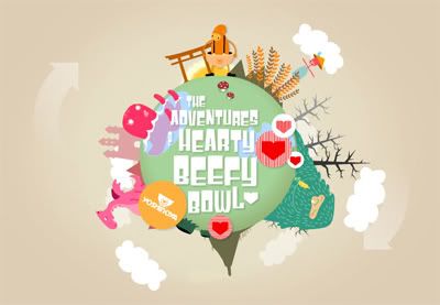
I'm quite suprise with this Yoshinoya corporate website, this website is more to graphic and cute style, and it's a flash website indeed. Although the food in Yoshinoya is not very delicious, but I see something different from the website at least, the background music is quite cute and suits the design, just that it doesnt loop. Overall the color scheme is good, all the colors are quite consistent and compliments each other, the feeling is good.
Levi's® 501® 2007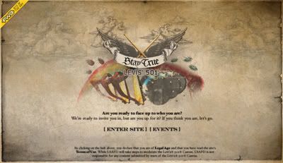
This is actually not Levi's corporate website, but is some kind of interactive website specially created for something, an event i guess. I like the color mood it has, very gothic and the montage of picture very consistent.
Converse Russia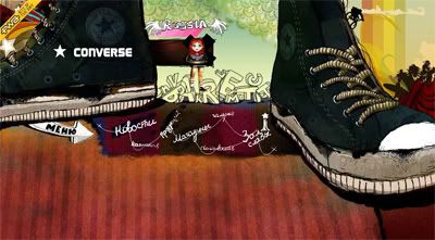
Although the color scheme is quite good, match the brand itself, but I don't see any content in their website. It's interactive though, I don't find any navigation or content, hopefully just my computer problem.
RÓTH ANIKÓ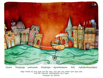
I like the website very much and always a good reference for my color mood study. The color scheme is so well planned and this website is quite interactive. The style of it is very unique, which is more like water colour style.
Saizen Media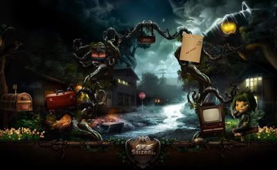
The color mood is very very good, overall color mood is more spooky but still a bit night pixie feel. The graphic is perfectly done, character design is cool. The only bad thing is the page took too much time loading, so it makes me cannot browse throughout the website because of my slow connection. In the conclusion, this website rocks!

No comments:
Post a Comment