The official websites of movies always my favourite
website and sites i will visit everytime i watch any
latest movies, especially for movies of sony pictures.
website and sites i will visit everytime i watch any
latest movies, especially for movies of sony pictures.
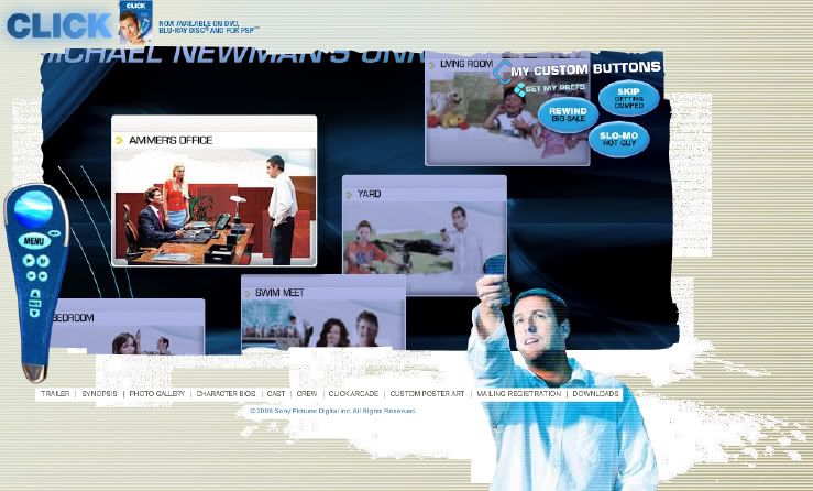
The website concept and the navigation is exactly the
same as the movie content itself, which is all related
to the remote control appeared in the movie.
same as the movie content itself, which is all related
to the remote control appeared in the movie.
-Navigation-
For me, it is quite convenient to navigate around,
because there are always quick links on the bottom so we
don't have to worry when we're lost.
because there are always quick links on the bottom so we
don't have to worry when we're lost.
For those who like to explore around, it's a very good
chance to experiment the scene appeared in the movie.
chance to experiment the scene appeared in the movie.
-Interactive-
There are several scenes where we can go to have to look
and explore. Let's say if we enter the living room, there are
and explore. Let's say if we enter the living room, there are
many items and characters which is clickable to listen
to some sound clips or see it animate.
Normally movie website will just focus on 'gallery' page or
'downloads' page, but this got really something more
so it really worth to spend some time to appreciate
their effort on the official website.
so it really worth to spend some time to appreciate
their effort on the official website.
-Colour-
The colour is fine because it is so recognizable and relates to
the movie itself. The colour of blue they using shows the
high technology too so I think it suits very well.
-Grid-
The grid is the same for every pages but for the
content part is slightly complex since it is a flash content.

2 comments:
again is sony picture one o .. hahah just finish critic sony .. ngek ngek :P
but this one is much more better as the link not in the same row and it use button to navigate.
i wont be like go to the wrong site this time.]
they use part of the movie as the transition and this was so creative as they blend it so well.
this site have not much words content. it more to scene of the movie. Although that is not much words they still plan the typo very well and choose a typeface that well blend woth the art direction.
the loading speed is ok. wont be too long waiting while there are animated flash n also some clip for the movie.
erm i found out one problem is their main navigation link look like disclaimers = ="
wow my 1 of my favourite movie CLICK >< so touch this movie T^T
Erm in the main site the word CLICK in the top, the outer glow is 2 much @@ it really uncomfortable when looking at it ...
i like the part the intro for this movie it make this movie like a interactive so you wan watch which part you can click on it....after i navigate all...i only realize it have a small navigation down there...which is "trailer/synopsis/....etc" if they wan insist so small for the navigation maybe they should change the colour to let user know that there a navigation in there
Post a Comment