I never think they will done that beautifully
on their official website. This website gives a
very comfortable feeling and they show obviously that
the benefits of this product which is to have a good night sleep.
-Navigation-
First of all, I like the cursor which is animated
to match the design, a small glowing flying creature.
So when we move to an object, the object will light up
while the rest objects are dark as in night.But for the
quick links navigation, it is quite difficult to explore.
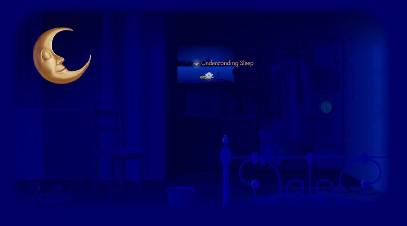
The main links are only three, which are
'Can't Sleep', 'Understanding Sleep', and 'Horlicks'.
-Interactive-
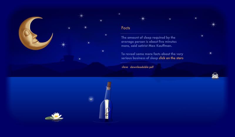
During the loading page, they did give us a lot of information
about Sleep. From the message I can feel that they're not
purposely to promote their products, but to educate us
more about Sleep. There is a part that few items floating
on the river, they're actually the links, so we can move
the cursor left right to check out the links.
-Colour-
They have very soft and comfortable colour and
with the colour they did bring out the feeling
that they want to deliver. The theme for the
website is Night, so they mainly use only
navy blue and the yellow of the moon.
-Grid-
I don't see the division of grid except for the
content on the centre of screen. The title and disclaimers
are not shown. The quick navigation links are not
shown until the mouse over the moon. So the arrangement
of this website is too simplified.

4 comments:
hmmm... actually dis website is nice concept and well promote their own product as well...but i was confused when explore over , there dun show whr is section that i m viewing..so user might b gt lost ...
before i start to comment on the site, please allow me to praise the way that u analysis the site. it was so in details and well arrange. very good effort ler~
horlick.. wow.. before that i still think like this kind of product (milk,milo..) all their web show only their product benefic, but this website have a strong concpet to hold whole web instead of just promoting their products. normally the web with all info ppl like us ( teenager ) wont go n visit or explore cause it is boring but now with a concept, they succes to make us to explore.
from here i realise that a concept of a web was so important which i never realise when i doing my web analysis on my blog. thx for such a good sharing.
ermm i feel some of the font size is a bit small. can be larger.
(link] naviation part)
hahah i realise the eye of moon will follow the cursoe.. :P
Wah~ HORLICKS.........everyday i also drinking as my breakfast T^T although everyday i also drink but i din know that it have so much benefit.....
A little confusing me when i navigate it which is the icon in the water and the sky :( erm....if the content add with a scoll bar, mayb will more good then a down and up button.
Overall is really interesting and a
and quite special @@ for me la...
Wah~!!
i never thought Holicks can have such a interesting website...
haha...
"big open eye world" ar....(direct transelate from chinese...hehe...)
1st of all...
the cursor is a firefly!!!
How cool is that!!
i always wanted to make 1!!
hehe...
The info in this web page is very good and it had been shown in a very interesting way...
the transection part is also very interesting, it give us infomation about sleep during the loading...
I had to aggree with Yi Wei that the Font size is too small, some user may not be able to view it...
The navigation is a bit confusing but after all its about sleep right?
it make us dizzy then we can sleep dee loh...
wakaka...
Post a Comment