I never think they will done that beautifully
on their official website. This website gives a
very comfortable feeling and they show obviously that
the benefits of this product which is to have a good night sleep.
-Navigation-
First of all, I like the cursor which is animated
to match the design, a small glowing flying creature.
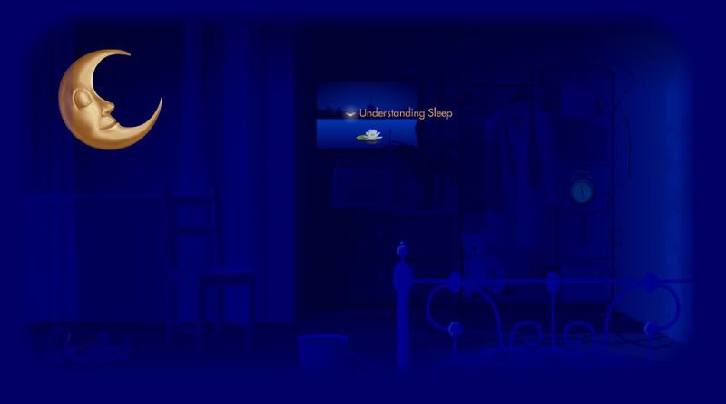
So when we move to an object, the object will light up
while the rest objects are dark as in night.But for the
quick links navigation, it is quite difficult to explore.
The main links are only three, which are
'Can't Sleep', 'Understanding Sleep', and 'Horlicks'.
-Interactive-
During the loading page, they did give us a lot of information
about Sleep. From the message I can feel that they're not
purposely to promote their products, but to educate us
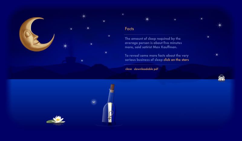
more about Sleep. There is a part that few items floating
on the river, they're actually the links, so we can move
the cursor left right to check out the links.
-Colour-
They have very soft and comfortable colour and
with the colour they did bring out the feeling
that they want to deliver. The theme for the
website is Night, so they mainly use only
navy blue and the yellow of the moon.
-Grid-
I don't see the division of grid except for the
content on the centre of screen. The title and disclaimers
are not shown. The quick navigation links are not
shown until the mouse over the moon. So the arrangement
of this website is too simplified.
